Getting started
Initialization and interactive usage
This section shall introduce you how to read data from a netCDF file and visualize it via psyplot. For this, you need to have netCDF4 and the psy-maps psyplot plugin to be installed (see install).
Furthermore we use the demo.nc netCDF file for our
demonstrations.
Note
We recommend to either run this example using our GUI. However, you can also either use IPython from the terminal via
conda install ipython  # or pip install ipython
ipython  # starts the ipython console
and copy-paste the commands in this example, or you use a jupyter notebook via
conda install jupyter  # or pip install jupyter
jupyter notebook  # starts the notebook server
Then create a new notebook in the desired location and copy-paste the examples below. If you want, we also recommend to include the following commands in the notebook
import psyplot.project as psy
# show the figures inline in the notebook and not in a separate window
%matplotlib inline
# don't close the figures after showing them, because than the update
# would not work
%config InlineBackend.close_figures = False
# show the figures after they are drawn or updated. This is useful
# for the visualization in the jupyter notebook
psy.rcParams['auto_show'] = True
After you installed psyplot, you can import the package via
In [1]: import psyplot
Psyplot has several modules and subpackages. The main module for the use of
psyplot is the project module.
In [2]: import psyplot.project as psy
Plots can be created using the attributes of the plot instance of
the ProjectPlotter.
Each new plugin defines several plot methods. In case of the psy-maps package, those are
In [3]: psy.plot.show_plot_methods()
barplot
    Make a bar plot of one-dimensional data
combined
    Plot a 2D scalar field with an overlying vector field
density
    Make a density plot of point data
fldmean
    Calculate and plot the mean over x- and y-dimensions
lineplot
    Make a line plot of one-dimensional data
mapcombined
    Plot a 2D scalar field with an overlying vector field on a map
mapplot
    Plot a 2D scalar field on a map
mapvector
    Plot a 2D vector field on a map
plot2d
    Make a simple plot of a 2D scalar field
vector
    Make a simple plot of a 2D vector field
violinplot
    Make a violin plot of your data
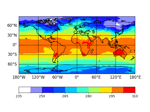
So to create a simple 2D plot of the temperature field 't2m', you can
type
In [4]: p = psy.plot.mapplot('demo.nc', name='t2m')

Note
If you’re not using the GUI, you have to
call the show() method to display the plot, i.e. just run
p.show()
Now you created your first project
In [5]: p
Out[5]: psyplot.project.Project([    arr0: 2-dim DataArray of t2m, with (lat, lon)=(96, 192), lev=1e+05, time=1979-01-31T18:00:00])
which contains the xarray.DataArray that stores the data and the
corresponding plotter that visualizes it
In [6]: p[0]
Out[6]:
<xarray.DataArray 't2m' (lat: 96, lon: 192)> Size: 74kB
array([[251.41689, 251.454  , 251.48915, ..., 251.29774, 251.33876, 251.37978],
       [254.16493, 254.33095, 254.50087, ..., 253.54774, 253.76845, 253.96376],
       [255.86024, 256.3114 , 256.72742, ..., 254.40712, 254.90517, 255.42665],
       ...,
       [263.70984, 263.6454 , 263.58875, ..., 263.96375, 263.86804, 263.78406],
       [262.4989 , 262.48718, 262.47742, ..., 262.5536 , 262.5321 , 262.51453],
       [260.8485 , 260.8661 , 260.88367, ..., 260.79578, 260.81335, 260.83093]],
      dtype=float32)
Coordinates:
  * lon      (lon) float64 2kB 0.0 1.875 3.75 5.625 ... 352.5 354.4 356.2 358.1
  * lat      (lat) float64 768B 88.57 86.72 84.86 83.0 ... -84.86 -86.72 -88.57
    lev      float64 8B 1e+05
    time     datetime64[ns] 8B 1979-01-31T18:00:00
Attributes:
    long_name:  Temperature
    units:      K
    code:       130
    table:      128
    grid_type:  gaussian

In [7]: type(p[0].psy.plotter)
Out[7]: psy_maps.plotters.FieldPlotter
The visualization and data handling within the psyplot framework is designed to be as easy, flexible and interactive as possible. The appearance of a plot is controlled by the formatoptions of the plotter. In our case, they are the following:
In [8]: p.keys()
+-------------------+-------------------+-------------------+-------------------+
| background        | bounds            | cbar              | cbarspacing       |
+-------------------+-------------------+-------------------+-------------------+
| clabel            | clabelprops       | clabelsize        | clabelweight      |
+-------------------+-------------------+-------------------+-------------------+
| clat              | clip              | clon              | cmap              |
+-------------------+-------------------+-------------------+-------------------+
| cticklabels       | ctickprops        | cticks            | cticksize         |
+-------------------+-------------------+-------------------+-------------------+
| ctickweight       | datagrid          | extend            | figtitle          |
+-------------------+-------------------+-------------------+-------------------+
| figtitleprops     | figtitlesize      | figtitleweight    | google_map_detail |
+-------------------+-------------------+-------------------+-------------------+
| grid_color        | grid_labels       | grid_labelsize    | grid_settings     |
+-------------------+-------------------+-------------------+-------------------+
| interp_bounds     | levels            | lonlatbox         | lsm               |
+-------------------+-------------------+-------------------+-------------------+
| map_extent        | mask              | mask_datagrid     | maskbetween       |
+-------------------+-------------------+-------------------+-------------------+
| maskgeq           | maskgreater       | maskleq           | maskless          |
+-------------------+-------------------+-------------------+-------------------+
| miss_color        | plot              | post              | post_timing       |
+-------------------+-------------------+-------------------+-------------------+
| projection        | stock_img         | text              | tight             |
+-------------------+-------------------+-------------------+-------------------+
| title             | titleprops        | titlesize         | titleweight       |
+-------------------+-------------------+-------------------+-------------------+
| transform         | transpose         | xgrid             | ygrid             |
+-------------------+-------------------+-------------------+-------------------+
they can be investigated through the Project.keys(),
summaries() and docs(), or the corresponding
low level methods of the Plotter class,
show_keys(),
show_summaries() and
show_docs().
Updating a formatoption is straight forward. Each formatoption accepts a certain
type of data. Let’s say, we want to have a different projection. Then we can
look at the types this formatoption accepts using the Project.docs()
In [9]: p.docs('projection')
projection
==========
Specify the projection for the plot

This formatoption defines the projection of the plot

Possible types
--------------
cartopy.crs.CRS
    A cartopy projection instance (e.g. :class:`cartopy.crs.PlateCarree`)
str
    A string specifies the projection instance to use. The centered
    longitude and latitude are determined by the :attr:`clon` and
    :attr:`clat` formatoptions.
    Possible strings are (each standing for the specified projection)

    =========== =======================================
    cf          try to decode the CF-conventions
    cyl         :class:`cartopy.crs.PlateCarree`
    robin       :class:`cartopy.crs.Robinson`
    moll        :class:`cartopy.crs.Mollweide`
    geo         :class:`cartopy.crs.Geostationary`
    northpole   :class:`cartopy.crs.NorthPolarStereo`
    southpole   :class:`cartopy.crs.SouthPolarStereo`
    ortho       :class:`cartopy.crs.Orthographic`
    stereo      :class:`cartopy.crs.Stereographic`
    near        :class:`cartopy.crs.NearsidePerspective`
    rotated     :class:`cartopy.crs.RotatedPole`
    =========== =======================================

    The special case ``'cf'`` tries to decode the CF-conventions in the
    data. If this is not possible, we assume a standard lat-lon projection
    (``'cyl'``)

See Also
--------
`Grid-mappings of cf-conventions <http://cfconventions.org/Data/cf-conventions/cf-conventions-1.8/cf-conventions.html#appendix-grid-mappings>`__

Warnings
--------
An update of the projection clears the axes!
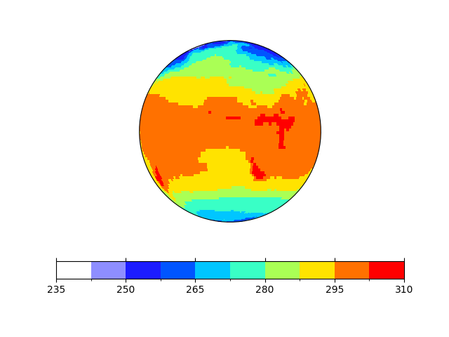
Let’s use an orthogonal projection. The update goes via the
Project.update() method which goes all the way down to the
psyplot.plotter.Plotter.update() and the
psy_maps.plotters.Projection.update() method of the formatoption.
In [10]: p.update(projection='ortho')

Note
Actually, in this case an update of the projection requires that the entire
axes is cleared and the plot is drawn again. If you want to know more about
it, check the requires_clearing
attribute of the formatoption.
Our framework also let’s us update the dimensions of the data we show. For example, if we want to display the field for february, we can type
# currently we are displaying january
In [11]: p[0].time.values
Out[11]: np.datetime64('1979-01-31T18:00:00.000000000')

In [12]: p.update(time='1979-02', method='nearest')

# now its february
In [13]: p[0].time.values
Out[13]: np.datetime64('1979-01-31T18:00:00.000000000')
which is in our case equivalent for choosing the second index in our time coordinate via
In [14]: p.update(time=1)
So far for the first quick introduction. If you are interested you are welcomed to visit our example galleries or continue with this guide.
In the end, don’t forget to close the project in order to delete the data from the memory and close the figures
In [15]: p.close(True, True, True)
Choosing the dimension
As you saw already above, the scalar variable 't2m' has multiple time
steps and we can control what is shown via the update()
method. By default, the mapplot()
plot method chooses the first time step and the first vertical level
(if those dimensions exist).
However, you can also specify the exact data slice for your visualization based
upon the dimensions in you dataset. When doing that, you basically do not have
to care about the exact dimension names in the netCDF files, because those are
decoded following the CF Conventions. Hence
each of the above dimensions are assigned to one of the general dimensions
't' (time), 'z' (vertical dimension), 'y' (horizontal North-South
dimension) and 'x' (horizontal East-West dimension). In our demo file,
the dimensions are therefore decoded as 'time' → 't',
'lev' → 'z', 'lon' → 'x',
'lat' → 'y'.
Hence it is equivalent if you type
In [16]: psy.plot.mapplot('demo.nc', name='t2m', t=1)
Out[16]: psyplot.project.Project([    arr0: 2-dim DataArray of t2m, with (lat, lon)=(96, 192), lev=1e+05, time=1979-02-28T18:00:00])
or
In [17]: psy.plot.mapplot('demo.nc', name='t2m', time=1)
Out[17]: psyplot.project.Project([    arr0: 2-dim DataArray of t2m, with (lat, lon)=(96, 192), lev=1e+05, time=1979-02-28T18:00:00])
Finally you can also be very specific using the dims keyword via
In [18]: psy.plot.mapplot('demo.nc', name='t2m', dims={'time': 1})
Out[18]: psyplot.project.Project([    arr0: 2-dim DataArray of t2m, with (lat, lon)=(96, 192), lev=1e+05, time=1979-02-28T18:00:00])
You can also use the method keyword from the plotting function to use the
advantages of the xarray.DataArray.sel() method. E.g. to plot the data
corresponding to March 1979 you can use
In [19]: psy.plot.mapplot('demo.nc', name='t2m', t='1979-03',
   ....:                  method='nearest', z=100000)
   ....:
Out[19]: psyplot.project.Project([    arr0: 2-dim DataArray of t2m, with (lat, lon)=(96, 192), lev=1e+05, time=1979-02-28T18:00:00])
Note
If your netCDF file does (for whatever reason) not follow the CF Conventions,
we interprete the last dimension as the x-dimension, the second
last dimension (if existent) as the y-dimension, the third last dimension as
the z-dimension. The time dimension however has to have the name
'time'. If that still does not fit your netCDF files, you can specify
the correct names in the rcParams, namely
In [20]: psy.rcParams.find_all('decoder.(x|y|z|t)')
Out[20]:
RcParams({'decoder.t': {'time'},
          'decoder.x': set(),
          'decoder.y': set(),
          'decoder.z': set()})
Configuring the appearance of the plot
psyplot is build upon the great and extensive features of the matplotlib package. Hence, our framework can in principle be seen as a high-level interface to the matplotlib functionalities. However you can always access the basic matplotlib objects like figures and axes if you need.
In the psyplot framework, the communication to matplotlib is done via
formatoptions that control the appearence of a plot. Each plot method
(i.e. each attribute of psyplot.project.plot) has several a set of
them and they set up the corresponding plotter.
Formatoptions are all designed for an interactive usage and can usually be
controlled with very simple commands. They range from simple formatoptions
like choosing the title to
choosing the latitude-longitude box of the data.
The formatoptions depend on the specific plotting method and can be seen via the methods
|
Classmethod to return a nice looking table with the given formatoptions |
|
Method to print the summaries of the formatoptions |
|
Method to print the full documentations of the formatoptions |
For example to look at the formatoptions of the
mapplot method in an interactive
session, type
In [21]: psy.plot.mapplot.keys(grouped=True)  # to see the fmt keys
******************
Axes formatoptions
******************
+------------+------------+------------+
| background | tight      | transpose  |
+------------+------------+------------+

**************************
Color coding formatoptions
**************************
+-------------+-------------+-------------+-------------+
| bounds      | cbar        | cbarspacing | cmap        |
+-------------+-------------+-------------+-------------+
| ctickprops  | cticksize   | ctickweight | extend      |
+-------------+-------------+-------------+-------------+
| levels      | miss_color  |             |             |
+-------------+-------------+-------------+-------------+

*******************
Label formatoptions
*******************
+----------------+----------------+----------------+----------------+
| clabel         | clabelprops    | clabelsize     | clabelweight   |
+----------------+----------------+----------------+----------------+
| figtitle       | figtitleprops  | figtitlesize   | figtitleweight |
+----------------+----------------+----------------+----------------+
| text           | title          | titleprops     | titlesize      |
+----------------+----------------+----------------+----------------+
| titleweight    |                |                |                |
+----------------+----------------+----------------+----------------+

***************************
Miscallaneous formatoptions
***************************
+-------------------+-------------------+-------------------+-------------------+
| clat              | clip              | clon              | datagrid          |
+-------------------+-------------------+-------------------+-------------------+
| google_map_detail | grid_color        | grid_labels       | grid_labelsize    |
+-------------------+-------------------+-------------------+-------------------+
| grid_settings     | interp_bounds     | lonlatbox         | lsm               |
+-------------------+-------------------+-------------------+-------------------+
| map_extent        | mask_datagrid     | projection        | stock_img         |
+-------------------+-------------------+-------------------+-------------------+
| transform         | xgrid             | ygrid             |                   |
+-------------------+-------------------+-------------------+-------------------+

***********************
Axis tick formatoptions
***********************
+-------------+-------------+
| cticklabels | cticks      |
+-------------+-------------+

*********************
Masking formatoptions
*********************
+-------------+-------------+-------------+-------------+
| mask        | maskbetween | maskgeq     | maskgreater |
+-------------+-------------+-------------+-------------+
| maskleq     | maskless    |             |             |
+-------------+-------------+-------------+-------------+

******************
Plot formatoptions
******************
+------+
| plot |
+------+

*****************************
Post processing formatoptions
*****************************
+-------------+-------------+
| post        | post_timing |
+-------------+-------------+

In [22]: psy.plot.mapplot.summaries(['title', 'cbar'])  # to see the fmt summaries
title
    Show the title
cbar
    Specify the position of the colorbars

In [23]: psy.plot.mapplot.docs('title')  # to see the full fmt docs
title
=====
Show the title

Set the title of the plot.
You can insert any meta key from the :attr:`xarray.DataArray.attrs` via a
string like ``'%(key)s'``. Furthermore there are some special cases:

- Strings like ``'%Y'``, ``'%b'``, etc. will be replaced using the
  :meth:`datetime.datetime.strftime` method as long as the data has a time
  coordinate and this can be converted to a :class:`~datetime.datetime`
  object.
- ``'%(x)s'``, ``'%(y)s'``, ``'%(z)s'``, ``'%(t)s'`` will be replaced
  by the value of the x-, y-, z- or time coordinate (as long as this
  coordinate is one-dimensional in the data)
- any attribute of one of the above coordinates is inserted via
  ``axis + key`` (e.g. the name of the x-coordinate can be inserted via
  ``'%(xname)s'``).
- Labels defined in the :class:`psyplot.rcParams` ``'texts.labels'`` key
  are also replaced when enclosed by '{}'. The standard labels are

  - tinfo: ``%H:%M``
  - dtinfo: ``%B %d, %Y. %H:%M``
  - dinfo: ``%B %d, %Y``
  - desc: ``%(long_name)s [%(units)s]``
  - sdesc: ``%(name)s [%(units)s]``

Possible types
--------------
str
    The title for the :func:`~matplotlib.pyplot.title` function.

Notes
-----
This is the title of this specific subplot! For the title of the whole
figure, see the :attr:`figtitle` formatoption.

See Also
--------
figtitle, titlesize, titleweight, titleprops
But of course you can also use the
online documentation of the
method your interested in.
To include a formatoption from the beginning, you can simply pass in the key and the desired value as keyword argument, e.g.
In [24]: psy.plot.mapplot('demo.nc', name='t2m', title='my title',
   ....:                  cbar='r')
   ....:
Out[24]: psyplot.project.Project([    arr0: 2-dim DataArray of t2m, with (lat, lon)=(96, 192), lev=1e+05, time=1979-01-31T18:00:00])
This works generally well as long as there are no dimensions in the desired data with the same name as one of the passed in formatoptions. If you want to be really sure, use the fmt keyword via
In [25]: psy.plot.mapplot('demo.nc', name='t2m', fmt={'title': 'my title',
   ....:                                              'cbar': 'r'})
   ....:
Out[25]: psyplot.project.Project([    arr0: 2-dim DataArray of t2m, with (lat, lon)=(96, 192), lev=1e+05, time=1979-01-31T18:00:00])
The same methodology works for the interactive usage, i.e. you can use
In [26]: p.update(title='my title', cbar='r')

# or
In [27]: p.update(fmt={'title': 'my title', 'cbar': 'r'})
Controlling the update
Automatic update
By default, a call of the update() method
forces an automatic update and redrawing of all the plots. There are
however several ways to modify this behavior:
Changing the behavior of one single project
in the initialization of a project using the auto_update keyword
In [28]: p = psy.plot.mapplot('demo.nc', name='t2m', auto_update=False)
setting the
no_auto_updateattributeIn [29]: p.no_auto_update = True
Changing the default configuration in the
'lists.auto_update'key in thercParamsIn [30]: psy.rcParams['lists.auto_update'] = False
Using the
no_auto_updateattribute as a context managerIn [31]: with p.no_auto_update: ....: p.update(title='test') ....:
If you disabled the automatical update via one of the above methods, you have to start the registered updates manually via
In [32]: p.update(auto_update=True)

# or
In [33]: p.start_update()
Direct control on formatoption update
By default, when updating a formatoption, it is checked for each plot whether
the formatoption would change during the update or not. If not, the
formatoption is not updated. However, sometimes you may want to do that and
for this, you can use the force keyword in the
update() method.
Creating and managing multiple plots
Creating multiple plots
One major advantage of the psyplot framework is the systematic management of multiple plots at the same time. To create multiple plots, simply pass in a list of dimension values and/or names. For example
In [34]: psy.plot.mapplot('demo.nc', name='t2m', time=[0, 1])
Out[34]:
psyplot.project.Project([
    arr0: 2-dim DataArray of t2m, with (lat, lon)=(96, 192), lev=1e+05, time=1979-01-31T18:00:00,
    arr1: 2-dim DataArray of t2m, with (lat, lon)=(96, 192), lev=1e+05, time=1979-02-28T18:00:00])
created two plots: one for the first and one for the second time step.
Furthermore
In [35]: psy.plot.mapplot('demo.nc', name=['t2m', 'u'], time=[0, 1])
Out[35]:
psyplot.project.Project([
    arr0: 2-dim DataArray of t2m, with (lat, lon)=(96, 192), lev=1e+05, time=1979-01-31T18:00:00,
    arr1: 2-dim DataArray of t2m, with (lat, lon)=(96, 192), lev=1e+05, time=1979-02-28T18:00:00,
    arr2: 2-dim DataArray of u, with (lat, lon)=(96, 192), lev=1e+05, time=1979-01-31T18:00:00,
    arr3: 2-dim DataArray of u, with (lat, lon)=(96, 192), lev=1e+05, time=1979-02-28T18:00:00])
created four plots. By default, each plot is made in an own figure but you can also use the ax keyword to setup how the plots will be arranged. The sort keyword allows you to sort the plots.
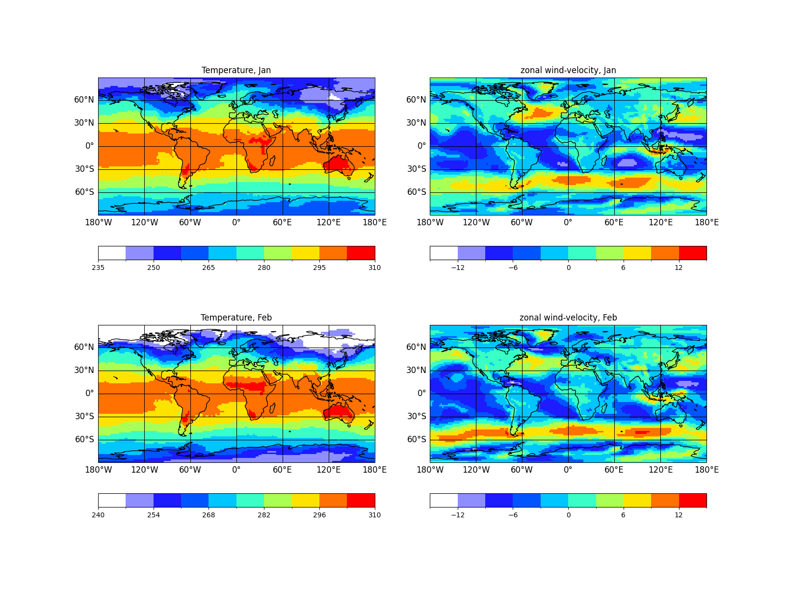
As an example we plot the variables 't2m' and 'u' for the first and
second time step into one figure and sort by time. This will produce
In [36]: psy.plot.mapplot(
   ....:     'demo.nc', name=['t2m', 'u'], time=[0, 1], ax=(2, 2), sort=['time'],
   ....:     title='%(long_name)s, %b')
   ....:
Out[36]:
psyplot.project.Project([
    arr0: 2-dim DataArray of t2m, with (lat, lon)=(96, 192), lev=1e+05, time=1979-01-31T18:00:00,
    arr1: 2-dim DataArray of u, with (lat, lon)=(96, 192), lev=1e+05, time=1979-01-31T18:00:00,
    arr2: 2-dim DataArray of t2m, with (lat, lon)=(96, 192), lev=1e+05, time=1979-02-28T18:00:00,
    arr3: 2-dim DataArray of u, with (lat, lon)=(96, 192), lev=1e+05, time=1979-02-28T18:00:00])

Warning
As the xarray package, the slicing is based upon positional indexing with
lists (see the xarray documentation on positional indexing).
Hence you might think of choosing your data slice via
psy.plot.mapplot(..., x=[1, 2, 3, 4, 5], ...). However this would result
in 5 different plots! Instead you have to write
psy.plot.mapplot(..., x=[[1, 2, 3, 4, 5]], ...). The same is true
for plotting methods like the
mapvector method. Since this
method needs two variables (one for the latitudinal and one for the
longitudinal direction), typing
In [37]:  psy.plot.mapvector('demo.nc', name=['u', 'v'])
ValueError: Can only plot 3-dimensional data!
results in a ValueError. Instead you have to write
In [38]: psy.plot.mapvector('demo.nc', name=[['u', 'v']])
Out[38]: psyplot.project.Project([    arr0: 3-dim DataArray of u, v, with (variable, lat, lon)=(2, 96, 192), lev=1e+05, time=1979-01-31T18:00:00])
Please have a look into the documentations of the
mapvector and
mapcombined for getting examples
on how to use this methods.
Slicing and filtering the project
Managing a whole lot of plots is basically the same as managing a single plot. However, you can always get the single array and handle it separately.
You can either get it through the usual list slicing (the Project class
actually is a simple list subclass) or you can use meta attributes,
dimensions and the specific arr_name
attribute. For the latter one, just call the project with your filtering
attributes
This behavior is especially useful if you want to address only some arrays
with your update. For example, let’s consider we want to choose a 'winter'
colormap for the zonal wind variable and a colormap ranging from blue to red
for the temperature. Then we could do this via
In [39]: p(name='t2m').update(cmap='RdBu_r')

In [40]: p(name='u').update(cmap='winter')
Note
When doing so, we recommend to temporarily disable the automatic update because then the figure will only be drawn once and the update will be done in parallel.
Hence, it is better to use the context manager
no_auto_update (see Automatic update)
In [41]: with p.no_auto_update:
   ....:     p(name='t2m').update(cmap='RdBu_r')
   ....:     p(name='u').update(cmap='winter')
   ....:     p.start_update()
   ....:
Finally you can access the plots created by a specific plotting method
through the corresponding attribute in the Project
class. In this case this is of course useless because all plots in maps
were created by the same plotting method, but it may be helpful when having
different plotters in one project (see The psyplot framework). Anyway, the plots
created by the mapplot method could be
accessed via
In [42]: p.mapplot
Out[42]:
psyplot.project.Project([
])
Saving and loading your project
Within the psyplot framework, you can also save and restore your plots easily and flexibel.
To save your project, use the save_project()
method:
In [43]: p.save_project('my_project.pkl')
This saves the plot-settings into the file 'my_project.pkl', a simple pickle
file that you could open by yourself using
In [44]: import pickle

In [45]: with open('my_project.pkl', 'rb') as f:
   ....:     d = pickle.load(f)
   ....:

In [46]: import os
   ....: os.remove('my_project.pkl')
   ....:
In order to not avoid large project files, we do not store the data but only the
filenames of the datasets. Hence, if you want to load the project again, make
sure that the datasets are accessible through the path as they are listed in the
dsnames attribute.
Otherwise you have several options to avoid wrong paths:
Use the alternative_paths parameter and provide for each filename a specific path when you save the project
In [47]: p.dsnames
Out[47]: {'demo.nc'}

In [48]: p.save_project(
   ....:     'test.pkl', alternative_paths={'demo.nc': 'other_path.nc'})
   ....:
pack the whole data to the place where you want to store the project file
In [49]: p.save_project('target-folder/test.pkl', pack=True)
specify where the datasets can be found when you load the project:
In [50]: p = psy.Project.load_project(
   ....:     'test.pkl', alternative_paths={'demo.nc': 'other_path.nc'})
   ....:
Save the data in the pickle file, too
In [51]: p.save_project('test.pkl', ds_description={'arr'})
To restore your project, simply use the
load_project() method via
In [52]: maps = psy.Project.load_project('test.pkl')
Note
Saving a project stores the figure informations like axes positions,
background colors, etc. However only the axes informations from from the
axes within the project are stored. Other axes in the matplotlib figures are
not considered and will not be restored. You can, however, use the
alternative_axes keyword in the Project.load_project() method if
you want to restore your settings and/or customize your plot with the
post formatoption (see
Adding your own script: The post formatoption)
Using presets
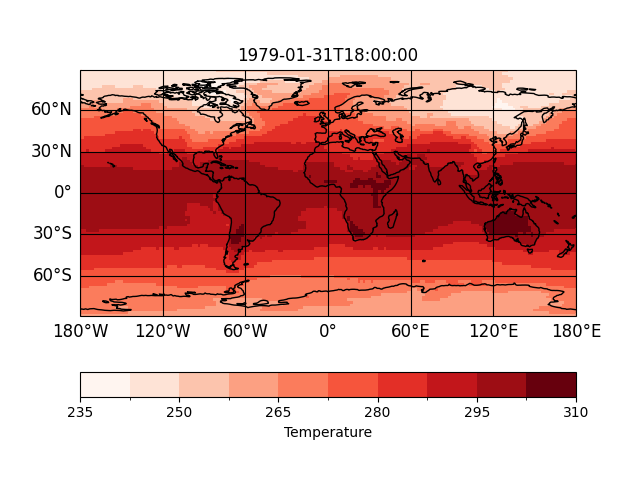
You can save and load presets to reuse the formatoption settings. For instance,
let’s say temperature should always use a 'Reds' cmap, the colorbar label
should show the long name and the title should be 'time'. This is of course
possible via
In [53]: sp = psy.plot.mapplot(
   ....:     'demo.nc', name='t2m', cmap="Reds", clabel="%(long_name)s",
   ....:     title='%(time)s')
   ....:

But instead of writing this all the time, you can also save it as a preset
In [54]: sp.save_preset("t2m-preset")
and reload this preset either via the preset keyword
In [55]: sp = psy.plot.mapplot('demo.nc', name='t2m', preset='t2m-preset')

or the load_preset() method
In [56]: sp.load_preset('t2m-preset')
You can list the available presets from the command line
In [57]: !psyplot --list-presets
t2m-preset: /root/.config/psyplot/presets/t2m-preset.yml
Adding your own script: The post formatoption
Very likely, you will face the problem that not all your needs are satisfied by the formatoptions in one plotter. You then have two choices:
define your own plotter with new formatoptions (see How to implement your own plotters and plugins)
- Pros
more structured approach
you can enhance the plotter with other formatoptions afterwards and reuse it
- Cons
more complicated
you always have to ship the module where you define your plotter when you want to save and load your project
can get messy if you define a lot of different plotters
use the
postformatoption- Pros
fast and easy
easy to save and load
- Cons
may get complicated for large scripts
has to be enabled manually by the user
For most of the cases, the post formatoptions
is probably what you are looking for (the first option is described in our
developers guide).
This formatoption is designed for applying your own postprocessing script to
your plot. It accepts a string that is executed using the built-in exec()
function and is executed at the very end of the plotting. In this python
script, the formatoption itself (and therefore the
plotter and
axes can be accessed inside the
script through the self variable. An example how to handle this
formatoption can be found in
our example gallery.