Note
This example requires the demo.nc file.
Basic data visualization on a map
Demo script to show all basic plot types on the map.
This example requires the psy-maps plugin and the file 'demo.nc' which contains one variable for the temperature, one for zonal and one for the meridional wind direction.
[1]:
import psyplot.project as psy
%matplotlib inline
%config InlineBackend.close_figures = False
# we show the figures after they are drawn or updated. This is useful for the
# visualization in the ipython notebook
psy.rcParams['auto_show'] = True
Visualizing scalar fields
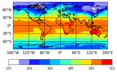
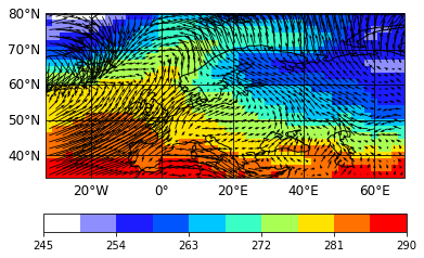
The mapplot method visualizes scalar data on a map.
[2]:
maps = psy.plot.mapplot('demo.nc', name='t2m')
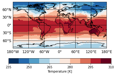
To show the colorbar label we can use the clabel formatoption keyword and use one of the predefined labels. Furthermore we can use the cmap formatoption to see one of the many available colormaps
[3]:
maps.update(clabel='{desc}', cmap='RdBu_r')
Especially useful formatoption keywords are
projection: To modify the projection on which we draw
lonlatbox: To select only a specific slice
xgrid and ygrid: to disable, enable or modify the latitude-longitude grid
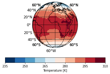
To use an orthogonal projection, we change the projection keyword to
[4]:
maps.update(projection='ortho')
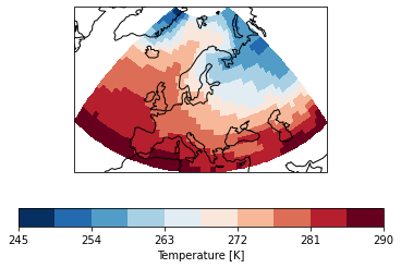
To focus on Europe and disable the latitude-longitude grid, we can set
[5]:
maps.update(lonlatbox='Europe', xgrid=False, ygrid=False)
There are many more formatoption keys that you can explore in the online-documentation or via
[6]:
psy.plot.mapplot.keys(grouped=True)
******************
Axes formatoptions
******************
+------------+------------+------------+
| background | tight      | transpose  |
+------------+------------+------------+

**************************
Color coding formatoptions
**************************
+-------------+-------------+-------------+-------------+
| bounds      | cbar        | cbarspacing | cmap        |
+-------------+-------------+-------------+-------------+
| ctickprops  | cticksize   | ctickweight | extend      |
+-------------+-------------+-------------+-------------+
| levels      | miss_color  |             |             |
+-------------+-------------+-------------+-------------+

*******************
Label formatoptions
*******************
+----------------+----------------+----------------+----------------+
| clabel         | clabelprops    | clabelsize     | clabelweight   |
+----------------+----------------+----------------+----------------+
| figtitle       | figtitleprops  | figtitlesize   | figtitleweight |
+----------------+----------------+----------------+----------------+
| text           | title          | titleprops     | titlesize      |
+----------------+----------------+----------------+----------------+
| titleweight    |                |                |                |
+----------------+----------------+----------------+----------------+

***************************
Miscallaneous formatoptions
***************************
+----------------+----------------+----------------+----------------+
| clat           | clip           | clon           | datagrid       |
+----------------+----------------+----------------+----------------+
| grid_color     | grid_labels    | grid_labelsize | grid_settings  |
+----------------+----------------+----------------+----------------+
| interp_bounds  | lonlatbox      | lsm            | map_extent     |
+----------------+----------------+----------------+----------------+
| mask_datagrid  | projection     | stock_img      | transform      |
+----------------+----------------+----------------+----------------+
| xgrid          | ygrid          |                |                |
+----------------+----------------+----------------+----------------+

***********************
Axis tick formatoptions
***********************
+-------------+-------------+
| cticklabels | cticks      |
+-------------+-------------+

*********************
Masking formatoptions
*********************
+-------------+-------------+-------------+-------------+
| mask        | maskbetween | maskgeq     | maskgreater |
+-------------+-------------+-------------+-------------+
| maskleq     | maskless    |             |             |
+-------------+-------------+-------------+-------------+

******************
Plot formatoptions
******************
+------+
| plot |
+------+

*****************************
Post processing formatoptions
*****************************
+-------------+-------------+
| post        | post_timing |
+-------------+-------------+
[7]:
psy.close('all') # we close the project because we create other figures below
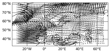
Visualizing vector data
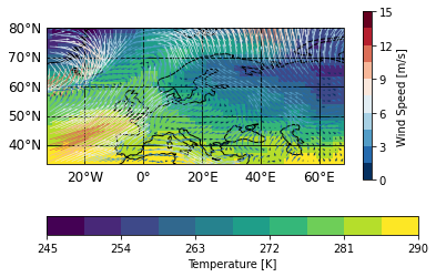
The mapvector method can visualize vectorized data on a map. But note that it needs a list in a list list to make the plot, where the first variable (here 'u') is the wind component in the x- and the second (here 'v') the wind component in the y-direction.
[8]:
mapvectors = psy.plot.mapvector('demo.nc', name=[['u', 'v']], lonlatbox='Europe',
                                arrowsize=100)
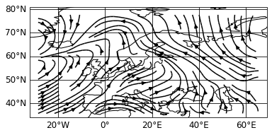
The plotter supports all formatoptions that the mapplot method supports. The plot formatoption furthermore supplies the 'stream' value in order to make a streamplot
[9]:
mapvectors.update(plot='stream', arrowsize=None)
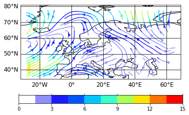
and we have two possibities to visualize the strength of the wind, either via the color coding
[10]:
mapvectors.update(color='absolute')
or via the linewidth
[11]:
mapvectors.update(color='k', linewidth=['absolute', 0.5])
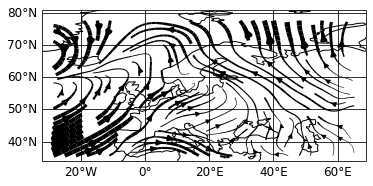
The second number for the linewidth scales the linewidth of the arrows, where the default number is 1.0
[12]:
psy.close('all')
Visualizing combined scalar and vector data
The mapcombined method can visualize a scalar field (here temperature) with overlayed vector field. This method needs 3 variables: one for the scalar field and two for the wind fields. The calling format is
psy.plot.mapcombined(filename, name=[['<scalar variable name>', ['<x-vector>', '<y-vector>']]])
[13]:
maps = psy.plot.mapcombined('demo.nc', name=[['t2m', ['u', 'v']]], lonlatbox='Europe',
                            arrowsize=100)
We can also modify the color coding etc. here, but all the formatoptions that affect the vector color coding start with 'v'
[14]:
psy.plot.mapcombined.keys('colors')
+--------------+--------------+--------------+--------------+
| color        | vcbar        | vcbarspacing | vcmap        |
+--------------+--------------+--------------+--------------+
| vbounds      | vcticksize   | vctickweight | vctickprops  |
+--------------+--------------+--------------+--------------+
| cbar         | bounds       | levels       | miss_color   |
+--------------+--------------+--------------+--------------+
| cmap         | extend       | cbarspacing  | cticksize    |
+--------------+--------------+--------------+--------------+
| ctickweight  | ctickprops   |              |              |
+--------------+--------------+--------------+--------------+
For example, let’s modify the wind vector plots color coding and place a colorbar on the right side
[15]:
maps.update(color='absolute', cmap='viridis', vcmap='RdBu_r', vcbar='r',
            clabel='{desc}', vclabel='Wind Speed [%(units)s]')
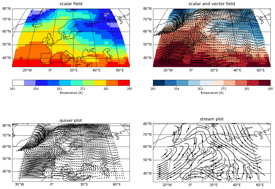
Summary
To sum it all up:
The mapplot method visualizes scalar fields
The mapvector method visualizes vector fiels
The mapcombined method visualizes scalar and vector fields
[16]:
# create the subplots
axes = psy.multiple_subplots(2, 2, n=4, for_maps=True)
# disable the automatic showing of the figures
psy.rcParams['auto_show'] = False
# create plots for the scalar fields
maps = psy.plot.mapplot('demo.nc', name='t2m', clabel='{desc}', ax=axes[0],
                        title='scalar field')
# create plots for scalar and vector fields
combined = psy.plot.mapcombined(
    'demo.nc', name=[['t2m', ['u', 'v']]], clabel='{desc}', arrowsize=100,
    cmap='RdBu_r', ax=axes[1], title='scalar and vector field')
# create two plots for vector field
mapvectors = psy.plot.mapvector('demo.nc', name=[['u', 'v'], ['u', 'v']],
                                ax=axes[2:])
# where one of them shall be a stream plot
mapvectors[0].psy.update(arrowsize=100, title='quiver plot')
mapvectors[1].psy.update(plot='stream', title='stream plot')
# now update all to a robin projection
p = psy.gcp(True)
with p.no_auto_update:
    p.update(projection='robin', titlesize='x-large')
    # and the one with the wind fields to focus on Europe
    p[1:].update(lonlatbox='Europe')
    p.start_update()
[17]:
psy.close('all')